

good day sunshine

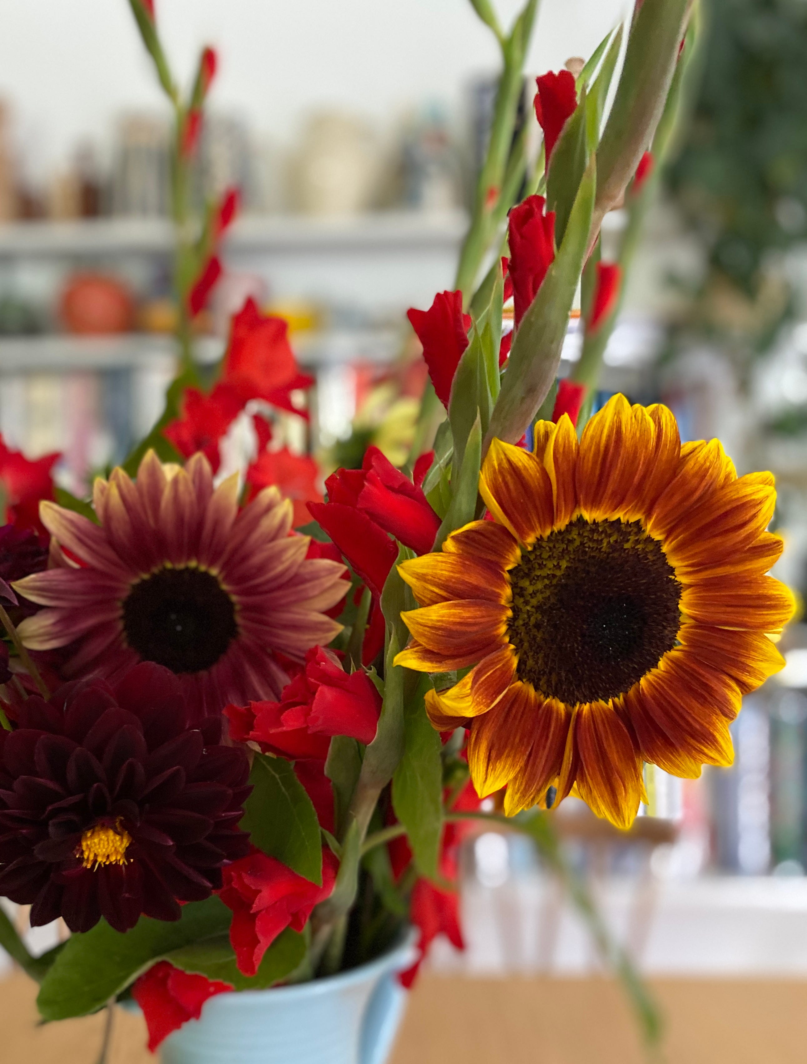
[sunflowers grown from seed in an allotment bunch]
Like sunflowers, I’m heliotropic. I adore sunshine and daylight, and I totally understand why Matisse moved from overcast, northerly Bohain to the south of France in search of sunlight and colour. Daylight was one of the most important criteria when we were looking for somewhere - even if it does show up the dust and fluff. Rather that, than gloom and shadows. I’ve always liked the adjective ‘etiolated’ when applied to pale, spindly, light-seeking plants, but it could equally apply to humans who don’t get enough UV light and vitamin D.
[plants at Hong Kong flower market]
I say all this about being a sun-worshipper because I’ve just begun to exploit another aspect of sunshine: making cyanotypes. I’ve wanted to have a go for several years now, but every time I booked a course something prevented me going (Covid, train strikes). Finally, three weekends ago, Phoebe and I went to City Lit for a cyanotype day and had a lovely time (incl. v gd cardamom buns at nearby Fabrique).
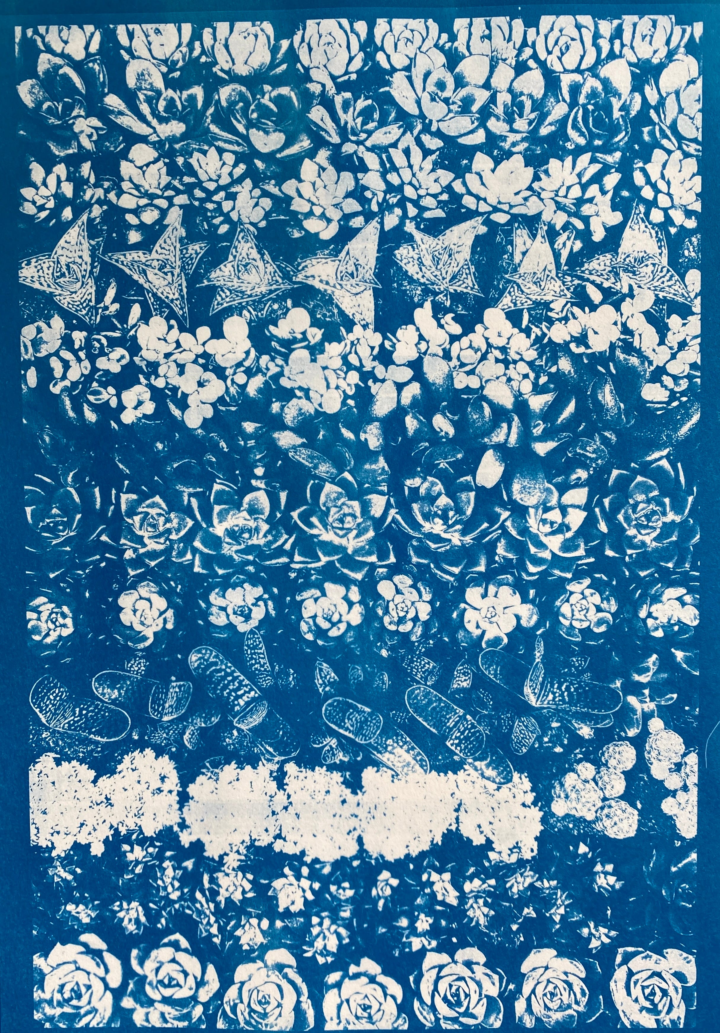
Cyanotypes have been around since the 1840s. It’s a simple camera-less, photographic process discovered by William Herschel and made famous by Anna Atkins who used it to document plants, flowers, leaves. You coat paper with a light-sensitive emulsion, dry it, then place either a negative or objects on the surface, expose it to sun or UV light in a light-box, then wash. The result is a wonderful Prussian blue, which explains why cyanotypes are commonly known as blueprints, a term I think I prefer.
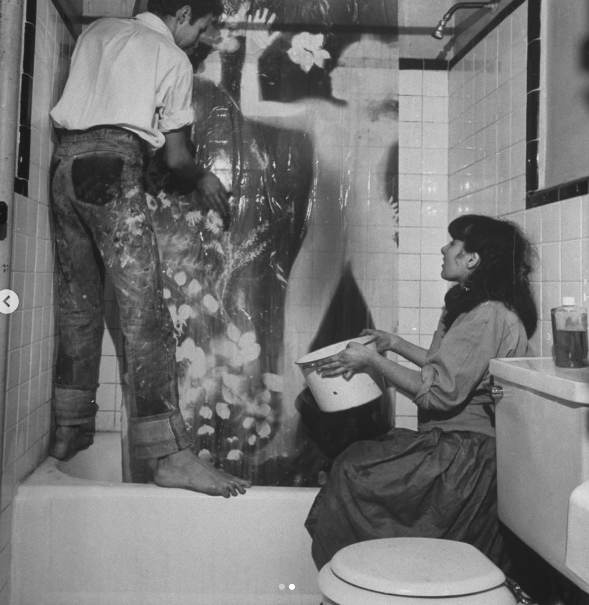
They were used by photographers as a way of making working proofs/contact prints (this is what Eadweard Muybridge did), and by architects and engineers to reproduce plans and drawings. You can still buy rolls of blueprint paper, and Susan Weil and Robert Rauschenberg created their famous full-scale human prints in their living room this way (above c1951, washing a print in their NY apartment).
I’ve not quite taken over the living room and bathroom as they did, but I can create a temporary tiny ‘dim room’ (a darkroom isn’t necessary) in order to handle the chemicals and paper, then I dry the coated sheets in the cramped but light-free space where the boiler is.
Ah yes, the chemicals. Only two are required, but how I love a bit of chemistry. I asked for chemistry sets for birthdays and Christmas when I was young, and loved Chemistry at school (nowadays I’d be able mix A level Chemistry with languages, but in those days there was no such mixing of Arts and Sciences). Sadly there are no test tubes involved with cyanotypes, but there is measuring, mixing, pouring, and generally feeling happily scientific. It may be very simple but, as with a lot of chemistry, it’s quite magical. Then all you need is light, and the great thing is that this key element - sunshine - is free, and it means you become something of a sky-watcher, weatherwoman, cloud-and-sun-spotter, attempting to predict how long you’ve got before the sun disappears and thus to calculate/guess exposure times.
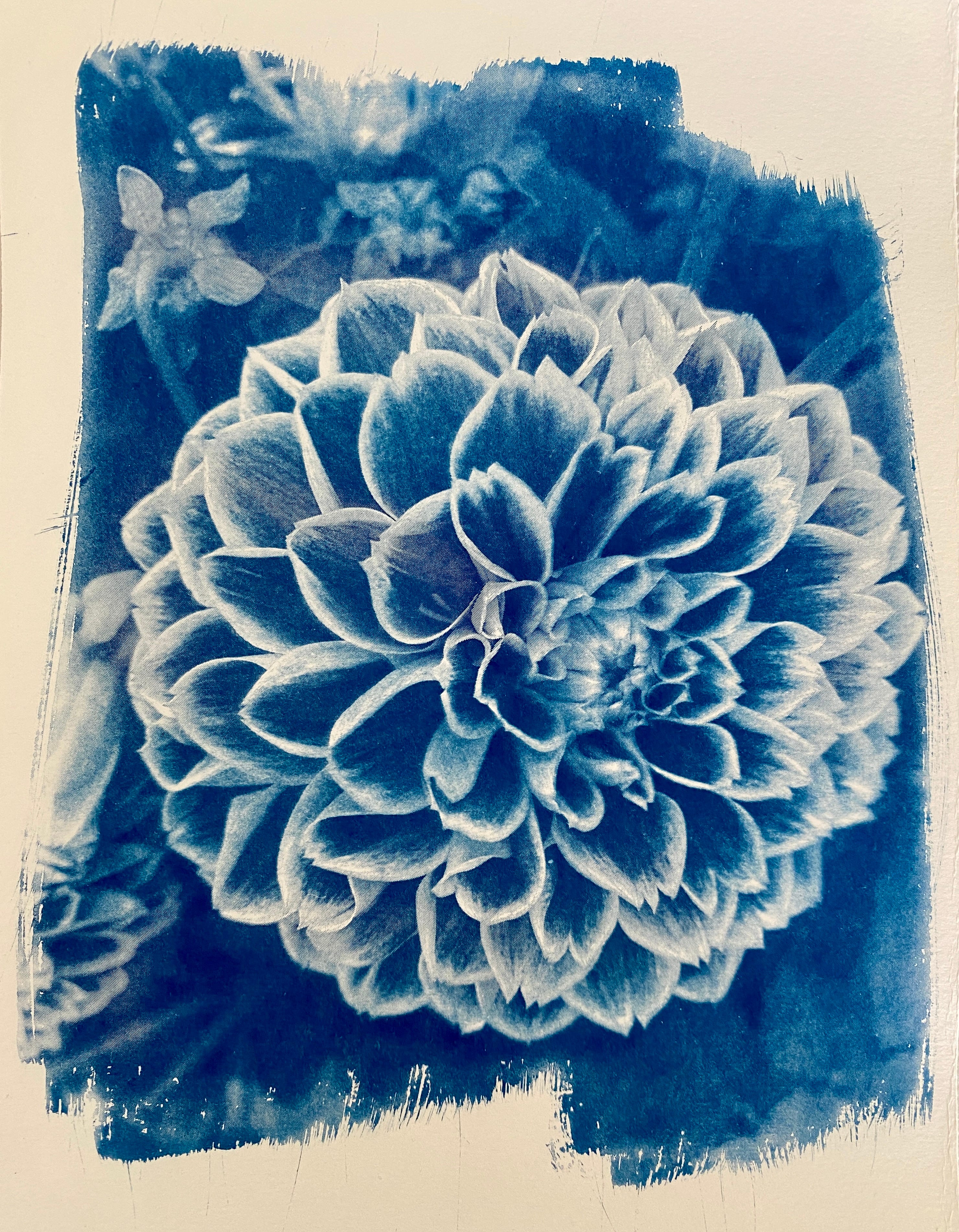
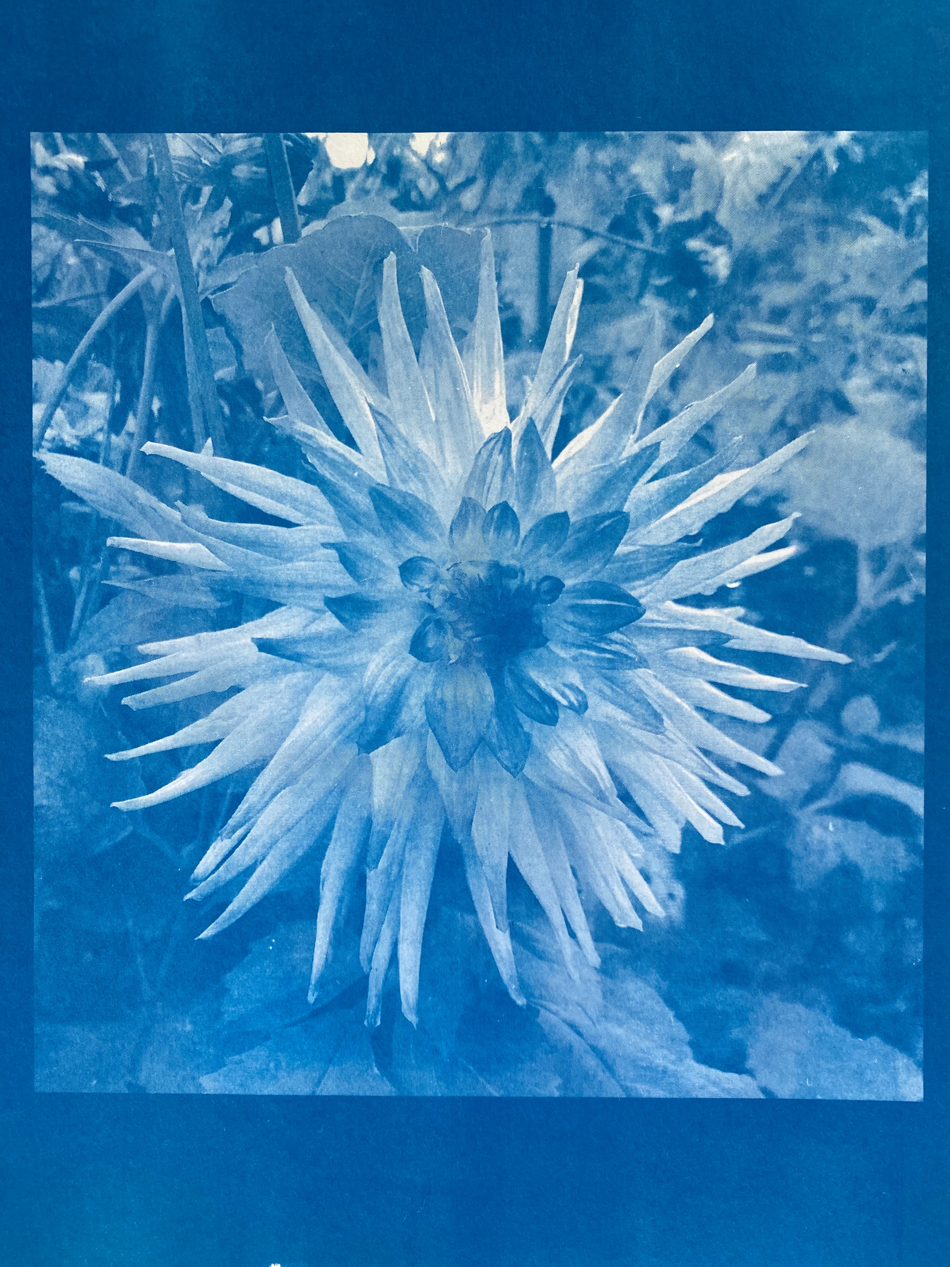
[dahlia]
I don’t intend to get all technical about it as much of the fun is treating each cyanotype as a one-off, so it can be a bit hit and miss at first. (I agree with the brilliant photographer Mme Yevonde that originality over technical know-how is key, not that I’m claiming any originality, only that I prefer experiments to dry theory). I rather like the amateur home lab approach: creating and printing my own black & white negatives on acetate sheets, not having a professional light box, working with whatever paper I have (often not suitable, as it turns out), using chopsticks for mixing the chemicals, and glass from an old picture frame to hold things in place. If I can’t do it all at home using what I have here, it’s not going to work for me. And the blue splashes wash off most things, I find. Not all, but most.
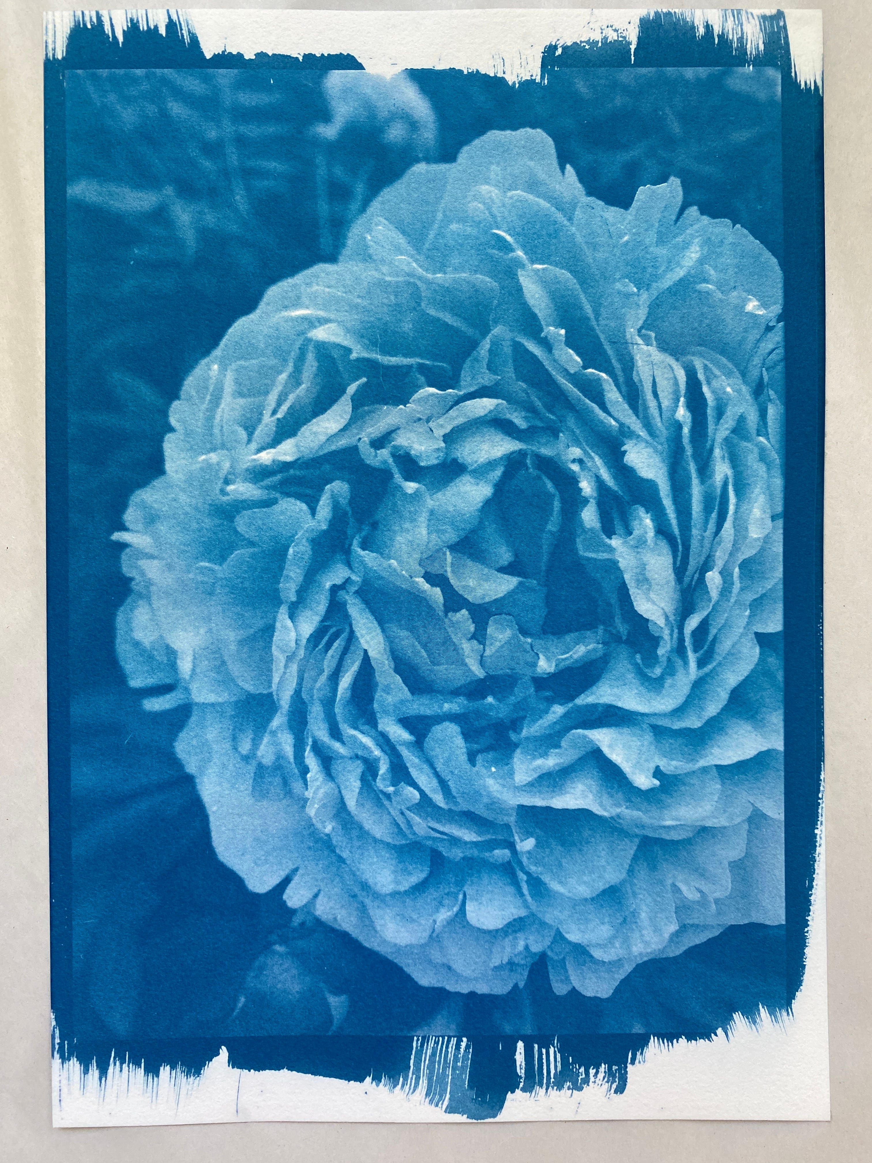
[peony]
Flowers are one of the subjects I’d like to get right, as the results can be beautifully ethereal and other-worldly.
[dahlia]
The process of turning subjects like flowers blue isn’t to everyone’s taste, I know, and some people find the blueness unnatural and unsettling. But I think it works well with botanical studies, when you want to highlight texture, translucence, delicacy, and create shadows and atmosphere.
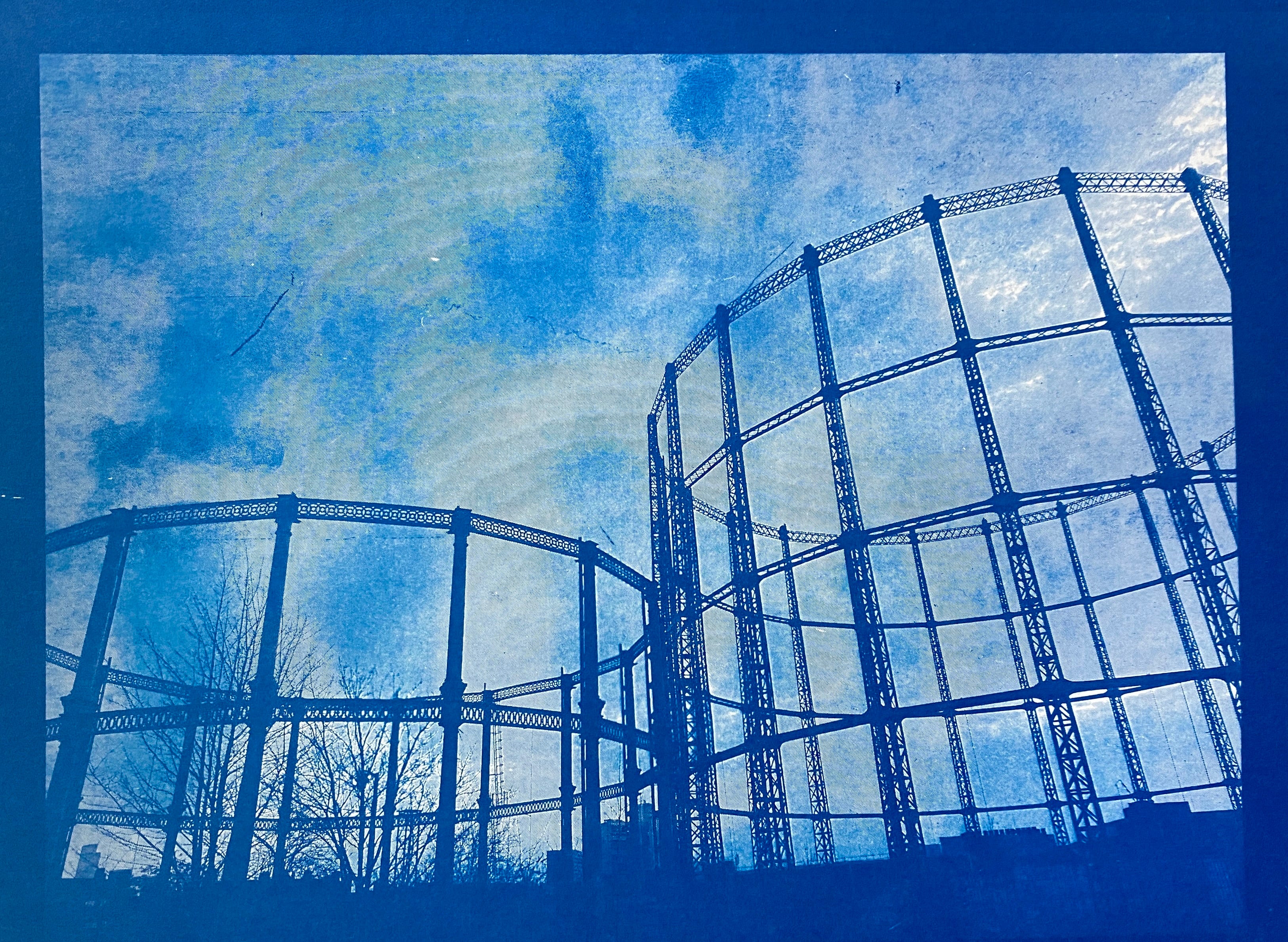
[Haggerston gasometers]
Architecture is also brilliantly suited to cyanotype, probably because of all the lines - reminders of original blueprints - but also because of the textural materials (brick, stone, metal, glass) and surfaces. I’m particularly fond of gasometers or gas holders which are fast-disappearing but absolute wonders of cast iron delicacy. They also look great against clouds which turn out well, all rather ominous and metaphorically spelling doom for gasometers.
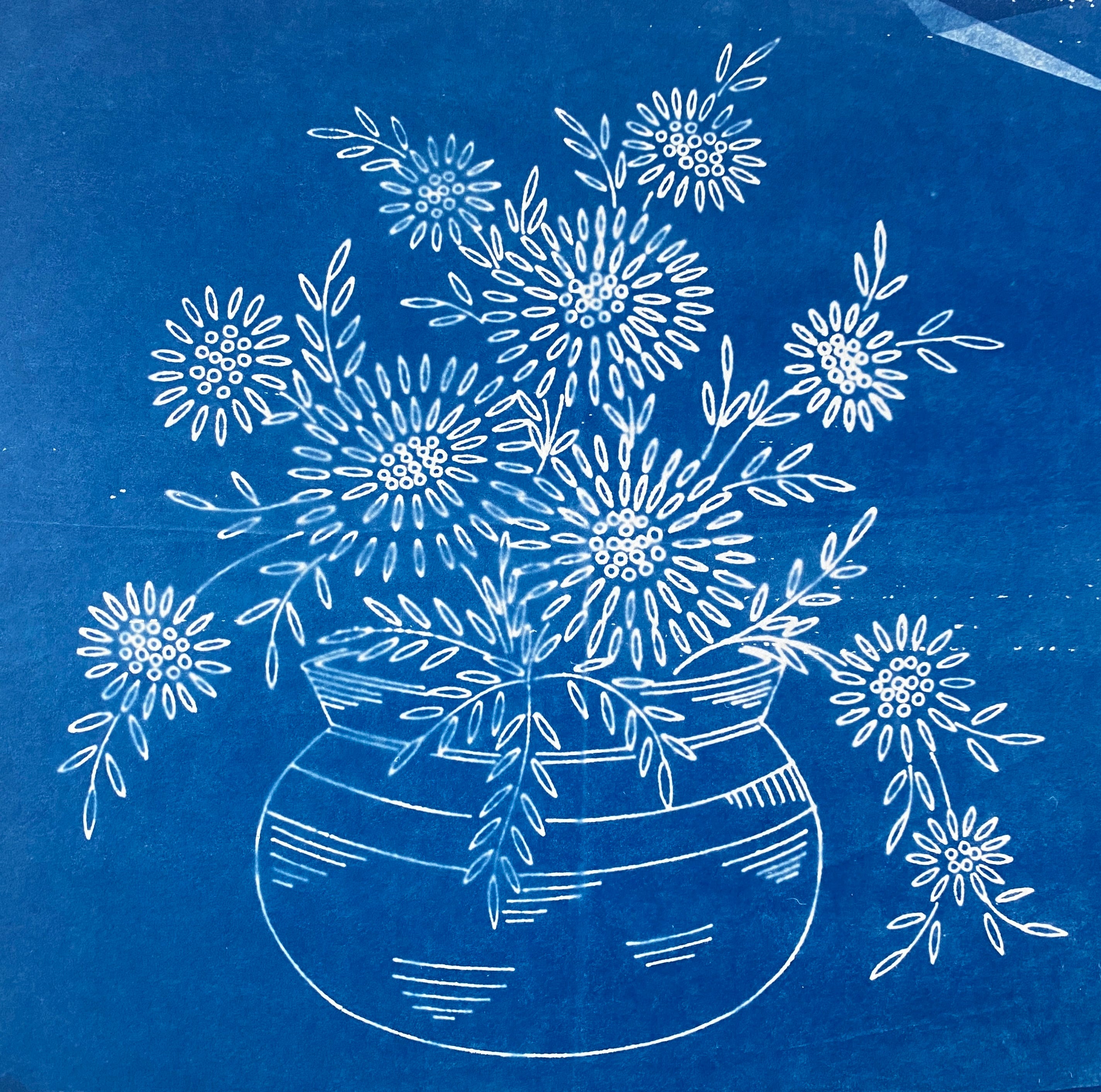
[Webber & Co Webco transfer]
Taking lines further, I’ve tried using an old embroidery transfer which is on very light, translucent paper. Even the creases and folds show up, a little like an X-ray.
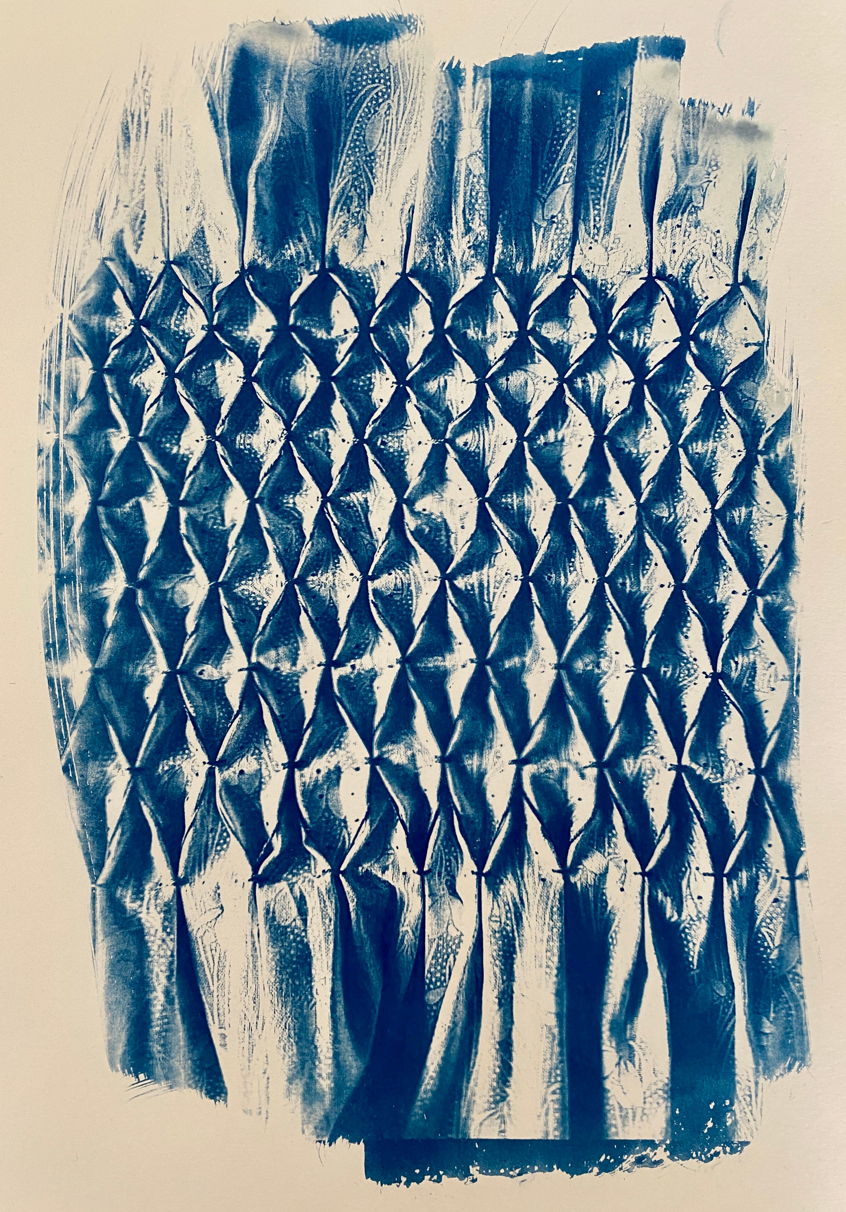
Smocking works well, too. There’s an interesting trompe l’oeil effect as the flat fabric which has been smocked is turned into a flat surface which still looks 3-D.
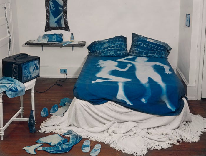
[‘The Blue Room’ (1981), Catherine Jensen]
I’ve used mainly negatives so far, and not tried many objects, but I like the way they can leave what looks like heat spots, a visual memory of contact, or of a bodily imprint (as with Rauschenberg and Weil’s work, and Catherine Jensen’s above), and traces of sunshine and warmth.
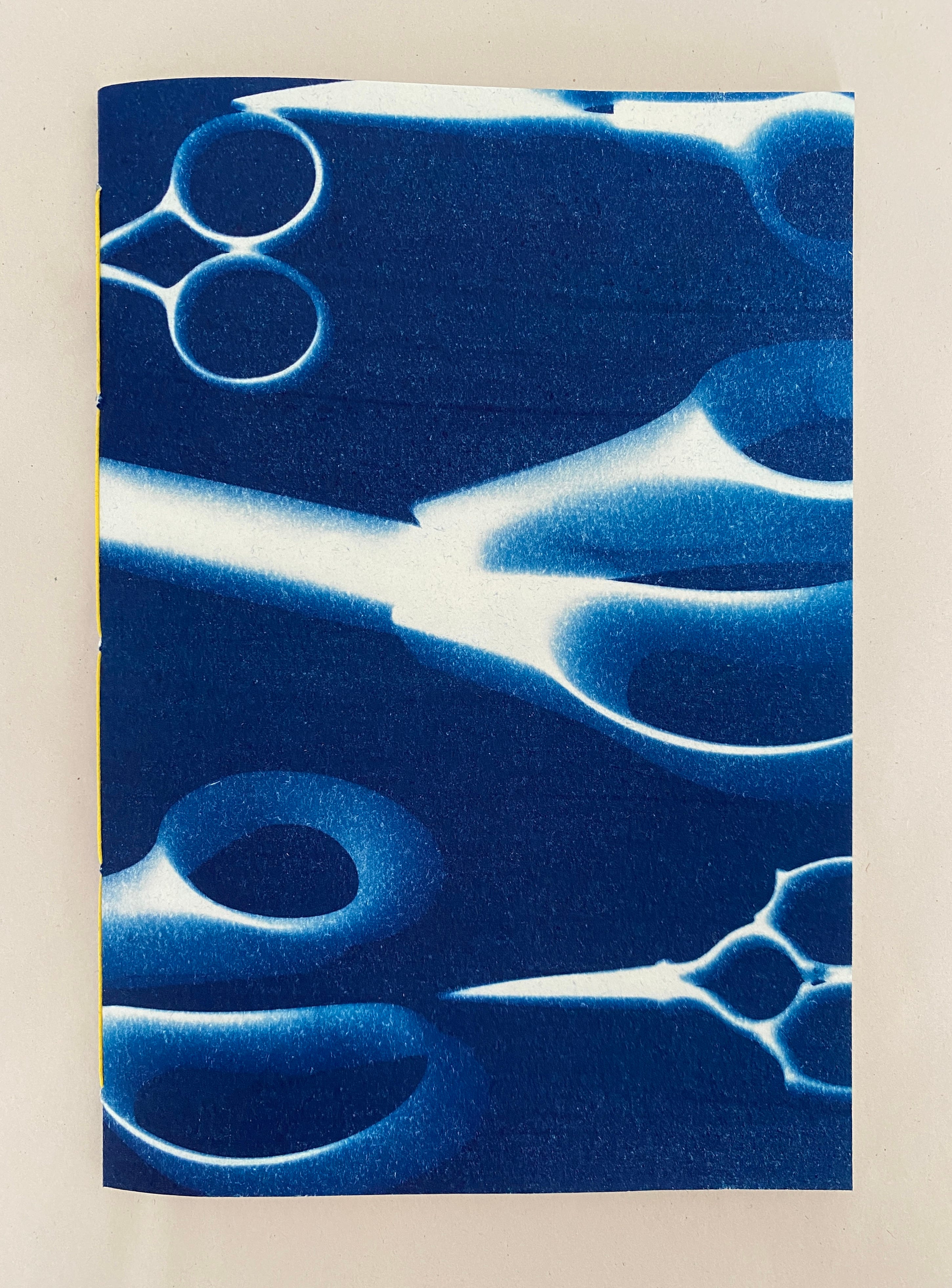
[scissor print]
There has been a fair amount of trial and error and binning: incorrect grammage of chemicals, incorrect reading of skies and light, incorrect paper, incorrect exposure, incorrect washing.
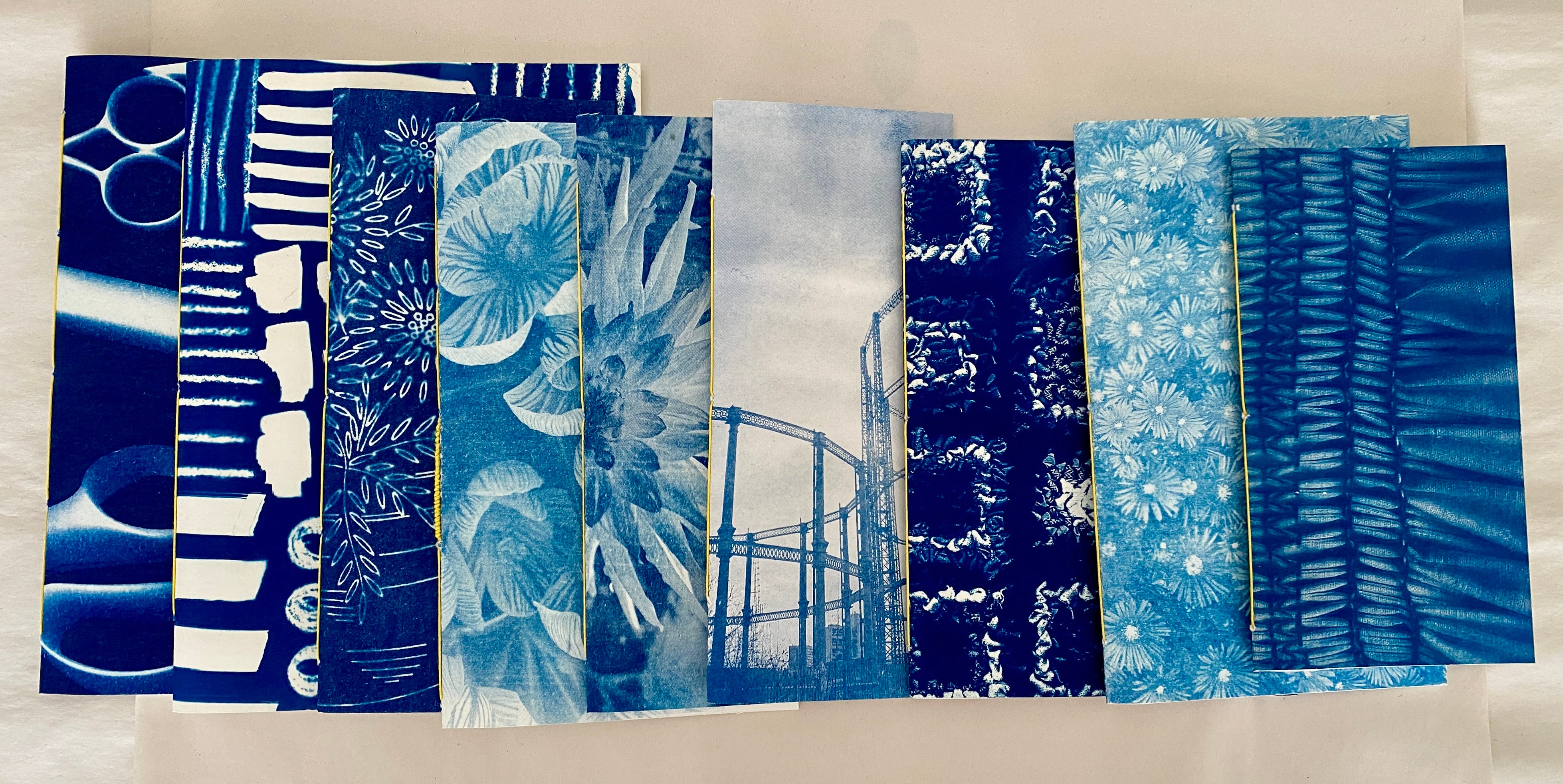
But I’m learning, and have discovered that the better sections of the better mishaps and failures make great covers for small notebooks bound with good-day-sunshine yellow linen thread.
This is definitely my Blue Period, pace Picasso.
Happy Sunday!
This is fascinating! Something I never knew about, and it is so effective.
The world in blue is strangely restful and disconcerting at the same time! I'm a great fan of gasometers. The image here takes them into Robert Macfarlane's "eerie" category: https://www.theguardian.com/books/2015/apr/10/eeriness-english-countryside-robert-macfarlane